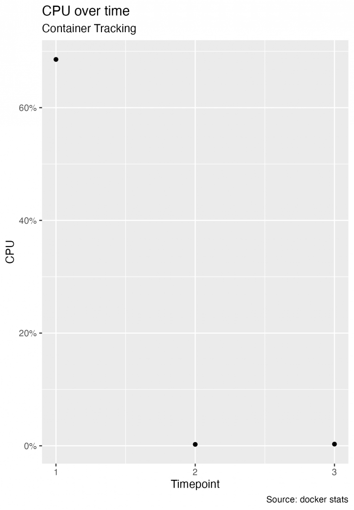
Given a dataframe (df) containing CPU measurements over time:
cpu memory_timepoint max_memory net_io_timeout max_net_io block_io_timepoint max_block_io index
1 0.686 27965522. 6067715047. 0 0 0 0 1
2 0.0025 27965522. 6067715047. 0 0 0 0 2
3 0.003 27797750. 6067715047. 0 0 0 0 3
This code will make a simple chart:
library('ggplot2')
library('scales')

ggplot(df, aes(x=index, y=cpu)) +
  geom_point(aes()) +
     labs(
       subtitle="Container Tracking",
       y="CPU",
       x="Timepoint",
       title="CPU over time",
       caption = "Source: docker stats") +
  scale_y_continuous(labels = scales::percent) +
  scale_x_continuous(breaks = pretty_breaks(n=max(df$index)))
Save the plot:
ggsave("~/Desktop/cpu.png", last_plot())